Everybody working with scrum will be familiar with a burn-down chart. Showing all the work that is not yet DONE, thus pending.
We also tried this at first but soon discovered that it did not show us a lot about progress during the sprint because the burndown chart often looks like this:
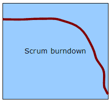
Simply put: nothing is done in the beginning of the sprint because the team is busy on all the stuff, and only at the end of the sprint you start to see that things are done. Because only at the end of the sprint, the things are really done.
This is common when you are doing short cycle sprints, that is your sprints only take two or three weeks instead of two months. And you want your sprints to be short, so what is the use of a burndown chart than? Not much. Do we have something else? Sure we do.
The alternative: the burn-up chart.
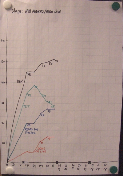
Have a look at a burnUP chart below, taken from one of our sprints:
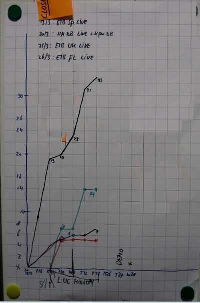
The lines on the burnup chart reflect the number of story points right of a particular column on the taskboard.
Monitoring progress goes much better when you measure tasks going through your process! This is as easy as counting the number of cards on your taskboard, or even better, counting the number of story points on the cards for each column you have on your task board.
Please note the small arrows on the taskboard below, at the top of some of the columns. I have added the red arrow, as that one was unfortunately missing in the picture below 😉
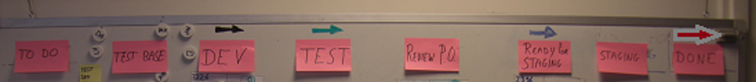
Click on image for a larger view.
Cards should go from left to right towards the ‘done’ column. And if that is the case, your burnup will look like the burnup chart above.
However, when developers and testers are moving cards in the opposite direction, from right to left on the teams scrumboard, the graph might surprisingly look something like this:
It’s the green line, -all story points right of the test column- that has been decreasing for three days in a row!
This means that development work was considered done by developers, moved into the test column at first but when tested put back to the dev-column and thus something is going wrong in that process. Maybe the devs and the QA’s did not agree how the work should have been done? Seems that developers think they can put stories to the right from DEV to TEST and the ones who test the work are putting the cards back into the dev column! Above, the black ‘dev-line’ has been increasing as well meaning more work was picked up while earlier work was not approved…
Not good, and something to talk about in the daily standup!
The good news with the burn-up chart is: at least you now know what is happing during the sprint instead of only afterwards when you have your retrospective!
PS: The burnup chart is exactly the same as the CFD (Cumulative Flow Diagram) as discribed on this page but the benefit of drawing it as a burnup next to your scrumboard is that it is in everybodies face 🙂